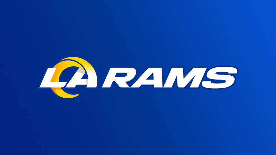
The Rams moved to LA from St. Louis a couple of years ago and have been trying to retool their identity since then. They don’t want to be seen as simply the St. Louis Rams of LA. They want the people of LA to buy into the Rams as a hometown team. One of the ways they are doing that is by updating their logo. Gone is the muted blue and gold from the St. Louis days. They have taken on a brighter and bolder scheme. The new look hasn’t come without it’s criticisms though. Complaints include everything from the use of a gradient in the horn to the admittedly awkward angles used on the quasi isometric Rams Head Logo. While the logo is a little jarring for those who are used to the traditional look, I don’t think it’s a bad concept for what they wanted to accomplish and I’ll explain why.

The new Ram Head was a necessity. As much as I liked the previous one. It had a clear 90’s aesthetic to it that many other teams have moved on from in the last several years. Unless you are fortunate enough to have a simple and timeless design like the Saints fleur-de-lis, you will need to change things up from time to time. The new Ram head is a fine adjustment. There are some minor issues that I would like to see them clean up though. The sharp angles around the chin are meant to keep the mascot looking aggressive and not too soft but they just don’t fit with the slightly more rounded points used in most of the rest of the design. I think they could’ve rounded these points just slightly and would still achieve the aggressive styling they are going for without sacrificing continuity.
 The “LA” logo is a compromise plain and simple. From the use of the letters LA in the logo to the gradient that is both imperfect and necessary, it is an attempt to solve several goals within the same concept. The team wanted to associate the new identity with the city of LA and felt that including the city initials in the logo was a good way to do it. They aren’t wrong. This is a perfect example of where design needs to accommodate marketing. It’s one thing to create an eye catching design. It’s another to have that design service the marketing goals of the brand. In this instance, they have done an admirable job. The “LA” logo will go a long way in associating the Rams brand with the city of Los Angeles. The gradient use in the horn while not ideal was necessary to help your eye distinguish the letter “A”. A full gold horn would have broken up the design too much and a full white horn would have muddied the separation around the “L”. The gradient was the most obvious solution to merge the two. As you can see with the Ram Head logo, they aren’t married to the gradient and are aware that it doesn’t always need to be used. The horn could not have been made larger because there would have been too much negative space and the horn couldn’t have been much small because the symbol of the mascot, the horn, would have been seen as an afterthought and not a feature. Although it may not win over everyone immediately, the design team did a great job considering the parameters, branding, and marketing goals that all needed to be accommodated in the logo. Over time and with a few small iterative changes going forward, I the new logo will grow on fans and service the team well.


