
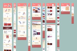
Most people are aware that they need to have their website designed with responsivity in mind but there is a big difference between “bad” responsive design and “good” responsive design. The vast majority of web traffic now is mobile and mobile screens come in all sorts of shapes and sizes. will your viewers be looking at your site on a Phone? Tablet? Phablet? Landscape or Portrait orientation? 4:3 16:9 or 20:9 aspect ratio? It’s not enough just to have your site shift elements around when viewed on a mobile screen. The design of your site needs to take into account the experience of using those screens. Navigating a site on a phone in portrait orientation is a much different experience than navigating a site on a tablet in landscape orientation. How will your site adapt to those differences?

Sites that don’t take these things into consideration may have elements overlap or disconnected from important descriptive information. Having 6 accompanying images may work well on a desktop when a viewer’s eyes can easily move around on the screen but when viewed on a phone it may just create a long train of images the viewer needs to scroll past before they get to the next bit of information.
When your site is difficult to navigate on a particular platform you may quickly lose the attention of potential viewers who prefer that platform. Google reports that visitors who have a negative experience on mobile platforms are 62% less likely to purchase from you or use your services in the future. That’s is huge!
A properly designed site will take into account the various ways your visitors may view it and will be designed from the ground up to adapt intuitively to different formats. You can’t simply shrink your content or shuffle elements vertically. The procession of information still needs to be laid out on a cohesive fashion. Some important information that is readily available for reference on a larger screen may need to find a different way to manage accessibility in a mobile environment. The last thing you want is for your visitors to feel the need to continuously scroll back and forth to connect relevant information. If your viewers need to hunt for relevant information they are far more likely to abandon your site altogether for an experience that is less frustrating. Keep in mind, just because YOU know where all of your content in doesn’t mean your visitors will intuitively be able to discover that content and view it in a format that puts what they are seeing in context with the overall theme and goals of your site.

